Color Palette
- smokku
Choosing a color palette for VPU is very important. It defines the characteristic
of visuals generated by the machine.
Commodore 64 palette of 16 colors is very unique. Evenly spread and pale, without
full brightness colors. With some distinctive colors glaringly missing - like sky blue.
It is a product of technical design and limitations of analog hardware part of VIC.
Atari 8bit palette consists of bands of colors of gradient of brightness. It is a byproduct
of how GTIA constructs colors in its analog hardware part. Unfortunately limitations
of how these colors are selected, cause Atari to either have bands of the same color
of different brightness, or bands of different colors of the same brightess.
This causes the impression of Atari having less color capabilities than C64.
Plus/4 stands somewhere in between. The colors are based on C64 limited colors,
but with additional circuitry to get 8 brightness levels. With grays covered by this
addition, there were some color places left to add more base colors. Yay blue! 🎉
Please read Carrion’s article praising +4 colors.
I wanted X65 feel to be similar to C64, +4 and Atari 8bit, yet unique enough to
stand different. I decided to have just 8 brightness levels, to convey the feeling
of limitations. First color is obvious: 8 levels of gray, but how to chose base
for the rest of 16 colors?
Let’s just split the 360° of color wheel into even parts, and place base colors there.
Then after applying the 8 bands of brightness we and up with final colors.
Not so fast… 0% brightness color is black. 100% brightness color is white. No matter
the base color. So let’s skip the first and last band of brightness. Keeping the
second brightness as starting point will give us 15 colors of the same brightness
as the second gray. Keeping the second to last brightness as ending point, will give
us 15 colors of the same brightness as the lightest gray. Artists should ❤️ it
for shading. This gives us 6 brightness slots to be divided over 8 brightness levels.
This makes the equation a bit complicated, but in fact really obvious.
First, an explanation, why do you see a divider /7 in the equation. Aren’t we
computing 8 brightness levels? Yes, but we are moving over 0..7 indexes, so while
0/n makes 0%, what n should we choose so 7/nths be 100%? Of course 7.
7/7 is 100%.
Starting with 1/7 we take x times a /7th of 5/7 (7 - 1 - 1 = 5).
Let’s simplify the equation:
= 1/7 + x * 5/7 /7

= 1/7 + 5x/7 /7

= (1 + 5x/7) /7

= (7/7 + 5x/7) /7

= (7 + 5x)/7 /7

= (7 + 5x)/7 * 1/7

= (7 + 5x) / (7 * 7)

= (7 + 5x) / 49

= (7 + 5 * x) / 49
Done? Not Yet… When plugging this values to HSB() model function, we need to provide
a color Saturation value. Saturation of 0% will give us a band of grays, so scratch that
and let’s plug 100%. This gives pretty usable colors, but in my opinion overly saturated.
100% saturation colors are characteristic of ZX Spectrum and Amstrad CPC, which is not
the look I am going for. We need to de-saturate colors somehow. Quick experimentation
plugging some non-100% values of saturation make edge colors (very dark and very bright)
to blend - they loose distinction of colors.
So, let’s keep edge colors at 100% saturation and have middle colors at 50% saturation.
Is there a function that goes from 1 to 0 and back to 1? Sure there is: cosine().
After extending the function period to 7, lowering the amplitude to 1/4 and
moving it up 3/4 I have what I need.
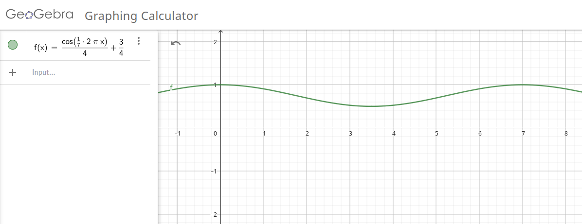
After plugging the equations to some simple JavaScript and generating visualization
in HTML table, the result was still a bit over-saturated
overall.
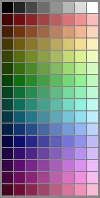
Let’s damp it whole a notch. Replacing + 3/4 with + 5/8,
I ended up with the following palette of colors:
Let’s check how it performs live… Recolored Carrion’s Tiger image looks like this:
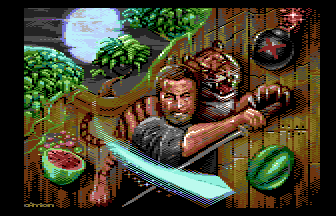
Color me impressed! 🥳